Art Framing in Minimalist Spaces - How Less Can Be More
Discover how the art of minimalist framing can elevate your space, blending elegance with simplicity. Learn the secrets to perfectly framing minimalist art to enhance, not overshadow. Dive into virtual framing solutions that revolutionize how we present art.

Art Framing in Minimalist Spaces: How Less Can Be More
Minimalism has captivated the world of art and design through its elegant simplicity, focusing on the idea that sometimes less truly is more. Despite its straightforward appearance, minimalist art presents a unique challenge when it comes to framing. The framing of minimalist artwork must complement the art without drawing attention away from it, maintaining the clean and uncluttered aesthetic that defines the minimalist style. In this post, we will explore the concept of framing minimalist artwork, particularly emphasizing the potential of virtual frames. Websites like PictureFrameGenerator.com are revolutionizing the way we present minimalist art in both digital and physical spaces.
Understanding Minimalist Art
Minimalism is predicated on the notion of achieving maximum effect with the most essential elements. Originating in the late 1950s and 1960s as a reaction against the expressive excess of Abstract Expressionism, minimalist art redirects focus from content to form.
By stripping away what is unnecessary, minimalist art invites viewers to appreciate harmony, purity, and order. The use of color, shape, and spatial relations is crucial, creating an art form that demands careful consideration and thoughtful interpretation.
The Concept of Framing Minimalist Art
When we talk about framing minimalist art, we're not just talking about putting a physical frame around a piece. Instead, we're considering how best to present the artwork so that it maintains its serene and austere quality. Traditional ornate frames that have heavy embellishments are typically avoided, as they can overshadow the artwork itself and disrupt the minimalist aesthetic.
A minimalist frame should be unobtrusive, allowing the artwork to be the focal point. These frames often have thin profiles and are constructed from materials such as simple woods, metals, or even acrylics. The color palette for these frames typically includes neutral tones like white, black, or natural wood finishes.
Virtual Frames and Modern Solutions
In the digital age, the concept of virtual frames has taken the art world by storm, providing artists with innovative ways to showcase their work. Virtual frames are particularly effective in maintaining the minimalist aesthetic because they are purely visual and do not physically intrude upon the artwork.
Websites like PictureFrameGenerator.com allow artists and curators to experiment with various framing styles and colors without committing to a physical frame. This site enables you to upload an image of your artwork, choose among different frame styles and colors, and even see how the piece would look in different room settings. This is a cost-effective and environmentally friendly way to experiment with framing and is especially useful for digital art presentations.

How to Choose the Right Virtual Frame
When selecting a virtual frame for minimalist art, consider the following guidelines to ensure that your choice enhances rather than detracts from the artwork:
Complement, Don't Compete
The frame should serve as a boundary for the artwork without competing for attention. For minimalist art, this might mean opting for a frame that matches the tonality or themes within the piece.
Match the Minimal Aesthetic
Choose frames that are as unobtrusive as possible. Thin profiles with clean lines work well to maintain the minimalist style. Matte finishes are usually more effective than glossy ones because they reduce reflections and keep focus on the artwork itself.
Experiment with Color and Contrast
While minimalist art typically employs a restrained palette, a frame can provide a subtle contrast, highlighting key elements of the artwork. Try testing different color combinations using virtual frames to find a perfect match.
Incorporating Framed Minimalist Art Into Your Space
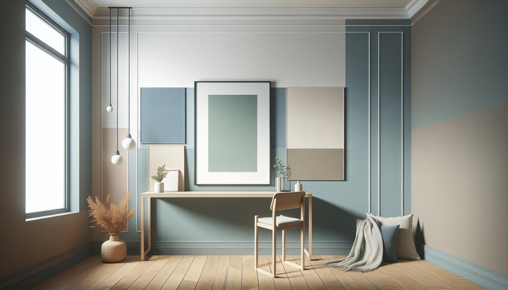
Minimalist spaces thrive on having a sense of openness and lack of clutter. As you incorporate framed minimalist art into a space, consider the following strategies:
Maintain a Cohesive Color Palette
Incorporate artwork with frames that either complement or provide a thoughtful contrast to the surrounding colors. This principle helps to achieve a seamless integration that feels intentional and balanced.
Grouping with Intention
If you’re hanging multiple pieces, consider spacing them evenly or grouping them in a pattern that feels harmonious with the space. Virtual tools can help visualize different layouts before committing to a particular setup.
Leverage Negative Space
In a minimalist space, negative space is just as important as the elements within it. Ensure that the artworks have adequate breathing room from each other and from other elements in the room.
The Impact of Framing on Art Presentation
The frame is the border through which we view art, and as such, its impact cannot be understated. In minimalist spaces, where "less is more," the frame serves as more than just a boundary; it's a part of the viewing experience, guiding the eyes gently to appreciate what's within. The use of virtual frames can provide a new dimension of flexibility and creativity, especially when dealing with minimalist art. They offer a way to experiment and visualize before physically framing a piece, ensuring the final product aligns with the desired aesthetic.
Conclusion
In conclusion, framing minimalist art in minimalist spaces necessitates an appreciation for subtlety, balance, and intention. The rise of digital tools, like PictureFrameGenerator.com, has made it possible to explore various framing options with ease and precision. By considering the frame not just as an accessory, but as an extension of the art itself, we can maintain the harmony and simplicity that are so very essential to minimalism. Whether you’re working with physical art pieces or digital illustrations, let your framing choices echo the minimalist mantra: less is indeed more.
Try the Picture Frame Generator
Upload your artwork, preview different frames, and download a realistic framed image in minutes.
Try the Picture Frame Generator